
In the race for “modern” aesthetics, many brands are flattening, simplifying, and redesigning their logos until they lose what made them themselves.
At Vibhe, we see it often — logos that look slick for a few months, but forgettable the year after.
Let’s talk about the most common mistakes teams make when rebranding, and how to avoid them.
Following Trends Instead of Building Legacy
Trends come and go — your brand shouldn’t.
Many companies jump on minimalism or 2D flattening without considering their long-term recognition. The result? A logo that looks like everything else.
A strong logo should feel recognizable, not fashionable. Think of it as your brand’s face: you can modernize it, but don’t change it so much that no one knows who you are anymore.
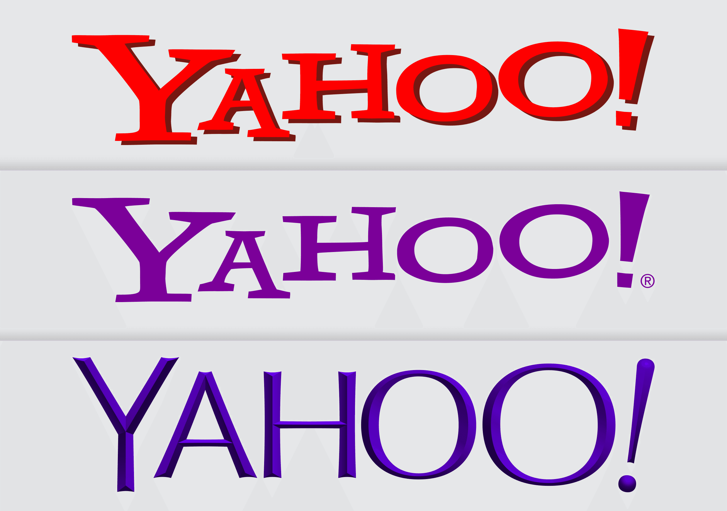
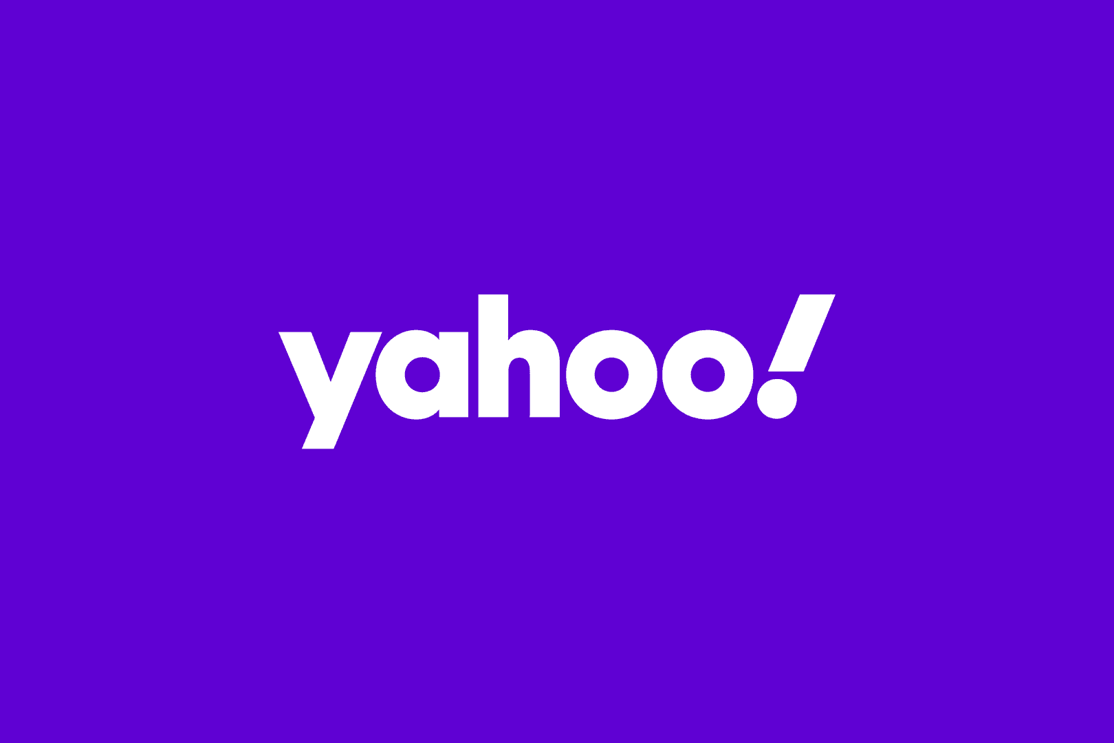
🧩 Example: Yahoo!
Yahoo’s 2019 rebrand aimed for a “modern, digital” feel, but lost the quirky personality that made the brand stand out. The old logo had character; the new one feels generic — a symptom of following minimalism trends over long-term recognition.
Great logos evolve — they don’t conform.
Losing Recognizability Across Sizes and Contexts
Your logo must work everywhere: on a billboard, a Twitter avatar, a product tag, or the corner of a mobile app.
If your design breaks when resized or cropped, it’s not ready.
The best logos keep their character — whether large, small, wide, or compact. Great design scales naturally.
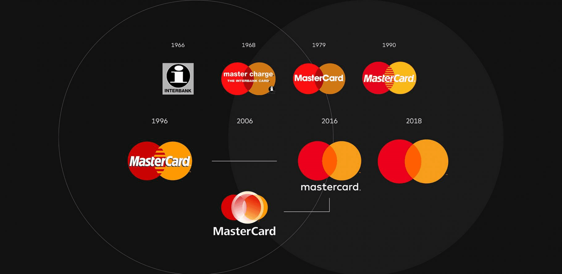
📱 Example: Mastercard
Mastercard’s 2016 redesign worked because it respected this rule. They simplified the mark but kept the overlapping circles — instantly recognizable even on an app icon.
Contrast that with Gap’s 2010 redesign, which dropped recognizability altogether — and was reversed within a week after public backlash.
Designing for Beauty Instead of Meaning
A logo is not a “cool visual exercise.” It’s a strategic tool.
It should represent what your brand stands for — your values, your tone, your energy.
If your logo doesn’t communicate that, it’s decoration, not identity.
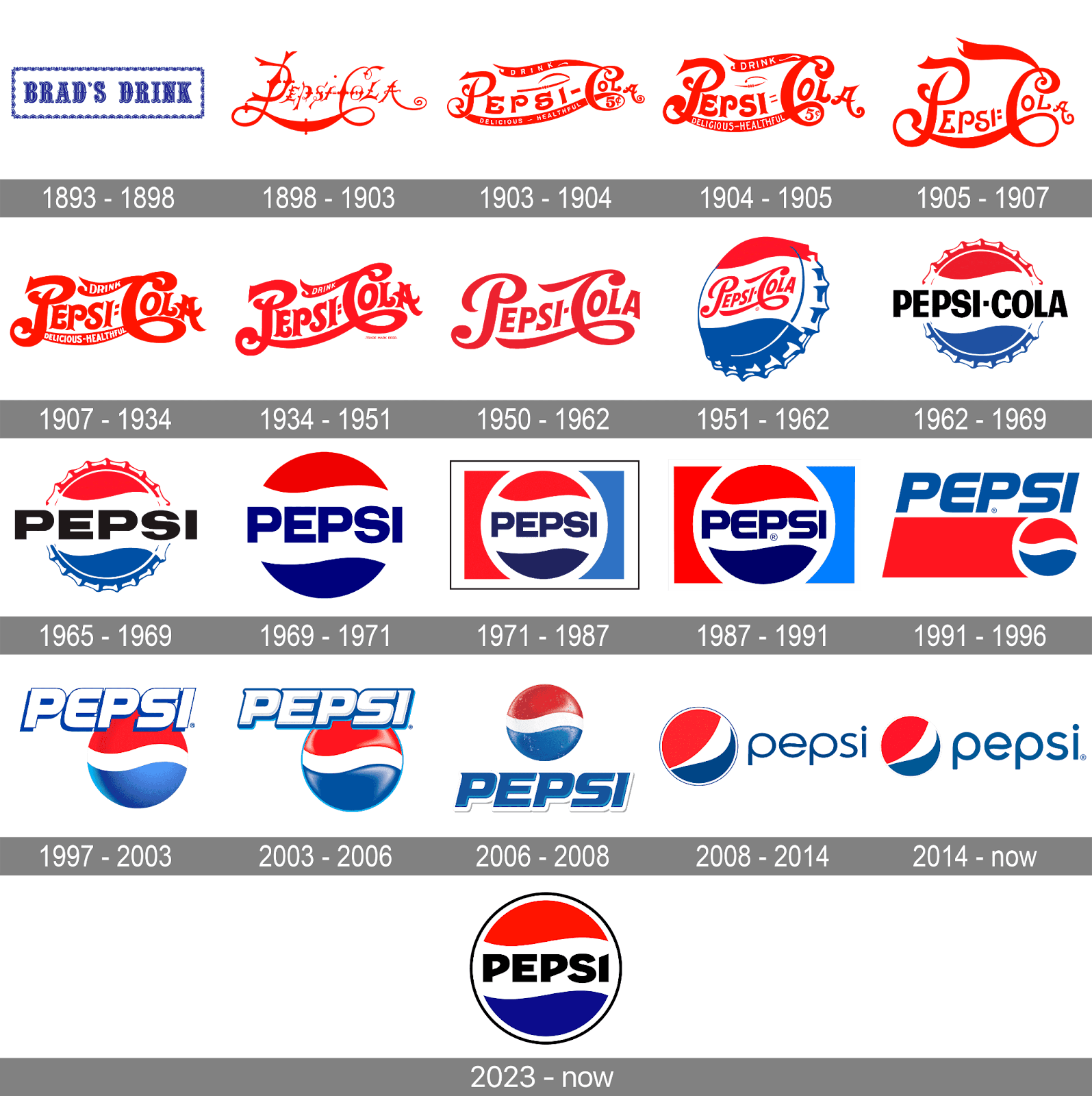
🎨 Example: Pepsi (2008)
Pepsi’s infamous redesign cost over $1 million and came with an overcomplicated “meaning” guide that nobody remembered. The result? A “cool” logo that lost connection to Pepsi’s energetic, youthful DNA.
Form should serve identity — not ego.
Forgetting About Color and Contrast
A logo should be instantly readable, in full color or monochrome, light or dark background.
When brands rely too much on gradients, thin lines, or low contrast, they lose visibility in real-world applications — especially on screens and print.
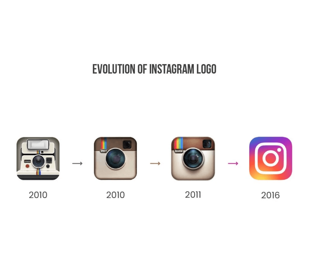
🌈 Example: Instagram (2016)
Instagram’s new gradient icon became a trendsetter — but also a visibility issue for many early users. The brand later fine-tuned contrast and saturation to make it more readable on different screens.
If your logo depends too much on color, it risks vanishing in grayscale or poor lighting.
No Connection Between Logo and System
Your logo isn’t an isolated piece of art — it’s part of a bigger ecosystem.
Typography, color palette, motion, and layout should all echo its visual DNA. When the logo and the design system don’t speak the same language, the brand feels inconsistent.
🧱 Example: Uber (2016–2018)
Uber’s 2016 “atom and bit” logo looked like a tech startup experiment — abstract and disconnected from the rest of its design system. Only in 2018 did Uber return to a simple, wordmark-based logo that integrated seamlessly into a unified identity system.

Overcomplicating the Redesign Process
Some companies redesign their logo every two years to “feel fresh.” But consistency builds trust.
Instead of chasing a completely new look, evolve it — refine details, modernize shapes, and improve usability while keeping recognition intact.
♻️ Example: Tropicana (2009)
Tropicana completely overhauled its packaging and logo — removing the familiar orange-with-a-straw icon. Customers stopped recognizing it on shelves, and sales dropped by 20% in two months.
The brand reverted to its old design almost immediately.
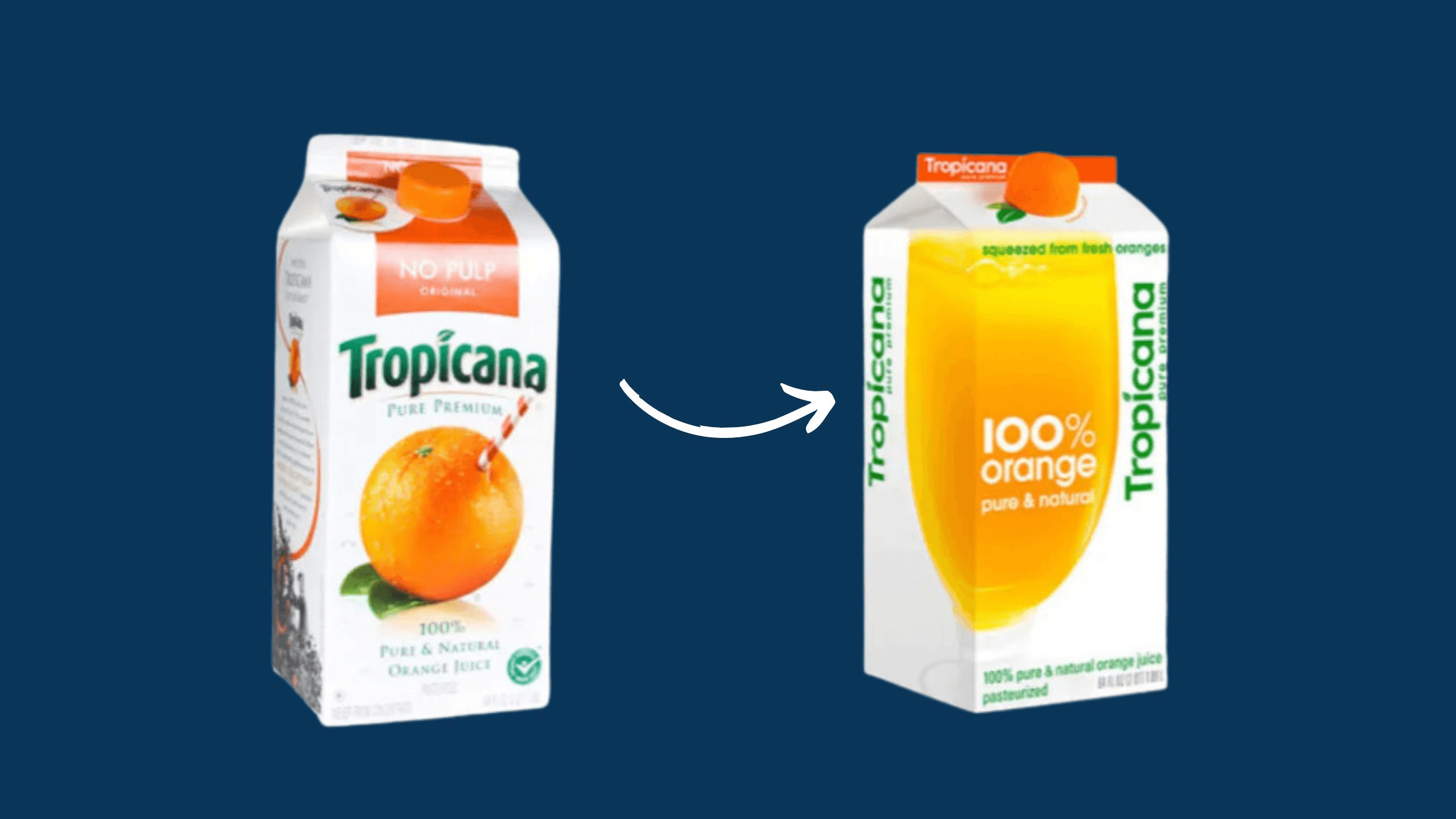
Small evolutions beat radical overhauls every time.
Great Logos Feel Inevitable
When a logo truly fits a brand, it doesn’t feel designed — it feels right.
That’s what we aim for at Vibhe: timeless visuals that don’t depend on trends, but on clarity, recognition, and emotion.
Related Articles


Vibhe is a modern product design and web-building studio that blends creativity with precision. We craft digital experiences that feel alive, bold in aesthetics, seamless in function, and built to inspire connection in the modern web.
VIBHE
portfolio
blog
Vibhe
©
2025